Best Looking, Best Selling
Are contemporary book covers fashion over function, or function as fashion?
By Sara Bir
Before the 1960s, an outstanding book jacket stood out easily in a desert of mediocrity. Today, it is less noticed. This is a good thing. The pleasure of browsing is heightened, and the quality of publisher’s output is constantly under pressure to improve.
-Marshall Lee, Bookmaking: The Illustrated Guide to Design/Production/Editing, 1979.
So now it’s 2002, and everything looks cool all of the time. Paper clips, toothbrushes, egg timers, ballpoint pens . . . The most mundane items have been getting candy-colored, pop-alux makeovers that could easily land them in a modern art museum. And books-much more significant purveyors of culture than office supplies and kitchen tools-are the brightest, boldest, and brassiest of all. Cruise into the local Barnes & Noble media mart, and the first thing you run into is a pillar of fancy new novels whose book jackets replicate the palette splashed across linen jackets hanging in the Gap across the street.
I will be the first to admit that I buy things just because they look cool: That would account for my green, plastic lemon reamer that looks like a little Martian (my wooden one works better), my Xiu Xiu T-shirt (don’t care for the band), and my baby-blue vinyl Electro Group 7 (don’t have a record player). Just as a sparkly, purple stapler won’t necessarily staple better, a neat-looking book only translates to a neat-reading book about half the time.
The publishing industry has invested a lot in the idea that our response to visual stimuli results in dropping money. If you go into a store to buy Ian McEwan’s Atonement because you’ve heard from everyone how good it is, the less-talked-about books there have to rely on their sheer good looks to get your attention-which has always been the case.
But contemporary book design has reached new strata of slickness in the past decade, incorporating more playful elements of pop culture and fabricating a “brand name” for the book. This can be a tricky path to steer, since a book’s contents are not soda or deodorant but an author’s thought and spirit. In a market of readers who respond to a color scheme that matches an iMac-the Oprah Book Club generation-any title that is not handed down from a mass-media consensus has to fend for itself, and the most immediate way to do this is to look spiffy in a bookseller’s featured display.
“I think we all now realize that a good cover can make a huge difference in sales,” says Rosa Herrington, manager at Copperfield’s Books in Petaluma. “If [customers] are not coming in with a particular book in mind, positioning in the store has a huge impact. Color, sizing, even the way a book feels affect the way it sells. It’s usually a function of the marketing.”
Playing further with the conception of book covers as built-in billboards, kitschy retro-chic style dances across a whole new crop of book jackets; consider the truncated WASP family dinner scene emblazoned on Jonathan Franzen’s The Corrections or the Roy Lichtensteinesque dots speckling the hardcover of Michael Chabon’s The Amazing Adventures of Kavalier and Clay. Such strong covers can gel with a book to the point that the cover is ingrained with the perception of the story.
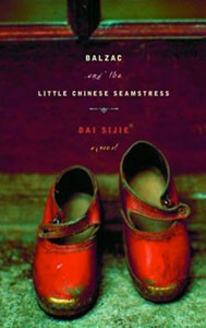
Herrington points out Dai Sijie’s 2001 novel Balzac and the Little Chinese Seamstress, whose jacket features a rich, jewel-toned photograph of two tiny leather Mary Janes. “It’s just gorgeous-a small book with a very charismatic cover. I believe that what moved it was [that] sellers not just liked what they read, but liked what they saw.” Booksellers prefer to display quality books, and browsers are drawn to displays-it’s the perfect combination. When Copperfield’s displayed Balzac, “it was selling like hotcakes.”
If Oliver Twist came out today and Charles Dickens were an unknown author, I wonder if there’d be an amber-tinted period photo of an anonymous filthy street urchin on the cover, crouching under an embossed title in some evocative font (sounds like Angela’s Ashes). In Dickens’ day, book covers did not extend beyond function; people were probably excited enough to have a book in the first place. How much flashier books have become since! Publishers’ designers are doing such a great job, we should hope that writers will be able to keep up with them.
From the April 18-24, 2002 issue of the North Bay Bohemian.


